

As a UX Designer at Compassion International, I designed a supportive sync experience for church leaders in slow-load environments
Loads that take too much time are cancellable.
Users often work in secretive conditions requiring dark mode.
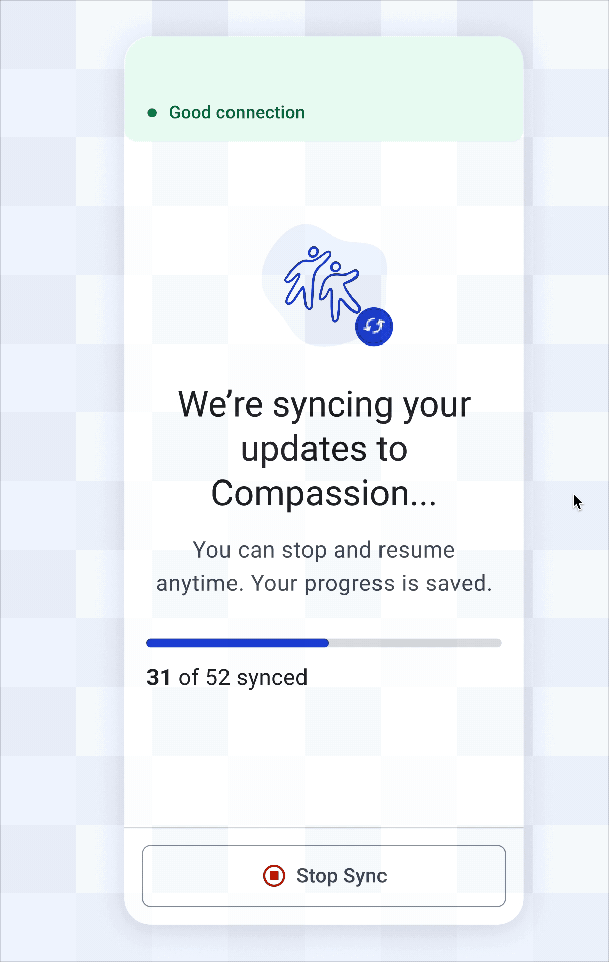
Live-time connection updates allow users to make decisions on whether or not to refresh
The Alternative Participant Profile (APP) is a mobile app created for Compassion church leaders crossing the Thailand-Myanmar.
Church leaders are partnering with Compassion to register these children in development programs centered on supporting their development and providing trauma care and disaster response.


When church leaders sync their updates, it often takes hours of time, preventing them from spending quality time with the children participating in their programs.

New participants have been added offline and are ready to sync.

Travel to nearby uphill cell tower for internet

Once connected, the user refreshes and waits for the sync to complete

1 hour passes, and the app is still on the loading screen

The user has run out of time to finish the sync. They travel back having lost hours of work time.
Once a user chooses to sync their changes, they are locked on to a loading screen until the syncing finishes, disabling them from using other parts of the app.

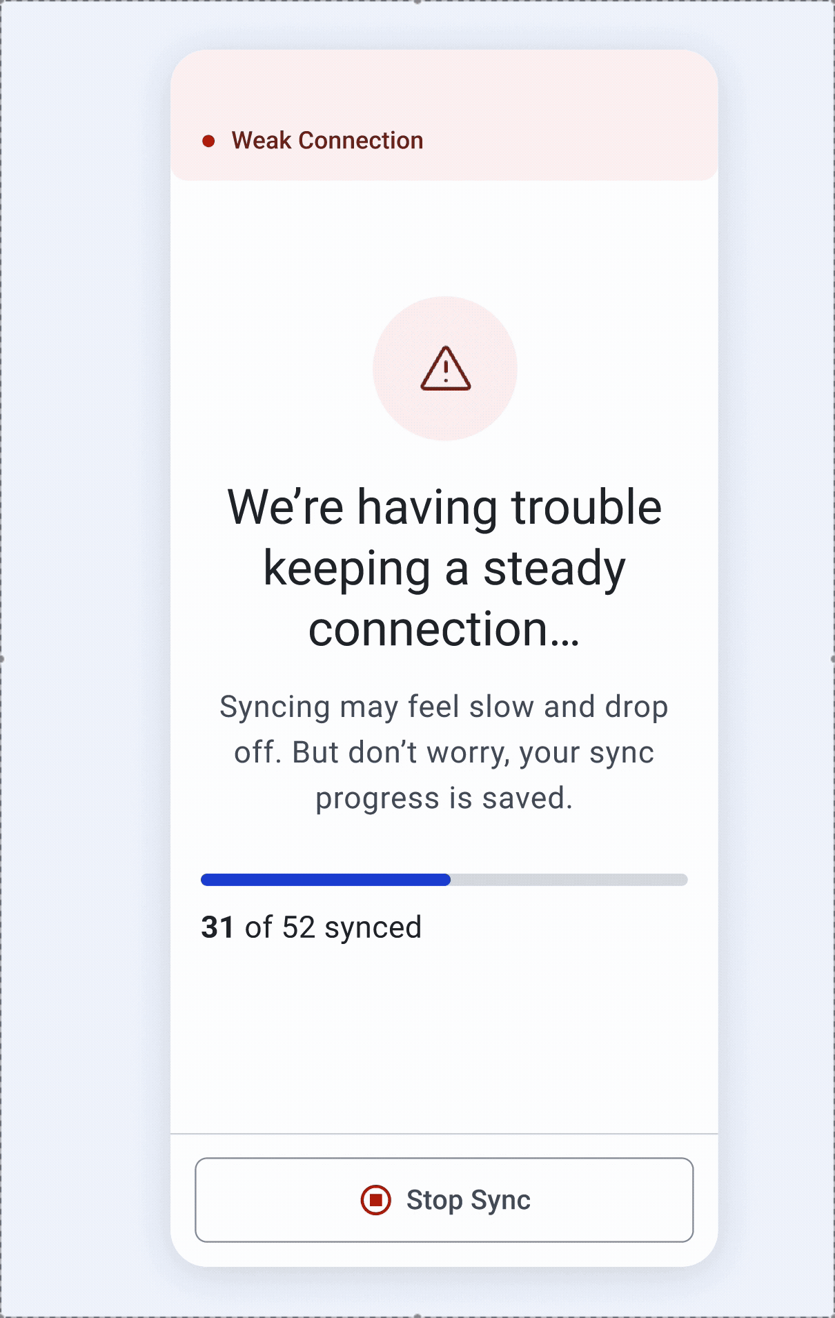
Users already have wifi strength testers on their phones. However, these testers are typically inaccurate in estimating the load time on APP because APP uses Starlink.
“My phone’s connection speed was strong, and WhatsApp worked perfectly. But when I refreshed on APP, it took 2 hours”
Users have freedom and control over loading state
Keep users informed on APP’s unique network state so they can make well-informed decisions on when to sync
Loading can make users feel powerless and frustrating.
Instead of locking users in a continuous loading state for hours, users are able to clearly stop the sync when they need to, gaining back time and productivity.

I considered creating a card-like loading indicator so users could see progress through skeleton loading, which would provide a greater sense of freedom during a load.
However, prioritizing communication and context in our loading screens required more space, so I used a full screen loading form.

Before choosing to sync, users can run a bandwidth check that gives them actionable information on whether to sync.
Stoplight colors in Asian cultures especially, are well understood in our other apps, so we leveraged the same color classification system here.

The design needed to balance complex technical information with simple, actionable feedback. Throughout my iterations, I explored ways to communicate network state simply and effectively. Working with color, I paid extra attention to ensure that the data was accessible.

Because syncing can be such an unpredictable and frustrating experience, I added as much context, support, and encouragement I could in the new design. This included:
1. Direct language on what is happening (without overcrowding the page)
2. Assurance that if a user needs to stop a sync, their progress will be saved
3. A progress bar that shows real-time sync progress

When developers presented the shipped design, I noticed the designs felt cold and clinical. Some changes I made were adding more meaningful brand iconography and improving copy to be more supportive.

When users sync changes, they are now given the complete context -- connection quality and progress. But most importantly, they are able to cancel syncs and are empowered to make sync decisions that work best for their workload and schedules.

Due to a constrained budget and timeline, we were unable to gather user feedback or data on the new designs. However, if I were to measure impact and next steps I would...
- Collect qualitative data from users about the sync experience before and after the new design implementation
- Collect satisfaction data on app experience
- Measure the frequency that the “stop sync” button is used
It was very important, especially for this project, to prioritize the dev and product voice. They were closest to our end users and have been on the project for a longer time. This meant understanding their design system needs and asking them questions about previous user behavior!
Because the developers were using material design as a base, I used the name naming system so they could easily plug in color values consistently in the code.
- Measure the frequency that the “stop sync” button is used

